



Prairie Sage Law - Branding
Project Summary
Performance Digital partnered with Elder Law and Life Care Planning Center to develop a new brand identity that better reflected the firm, its services, and the way it wanted to be represented moving forward.
The result was Prairie Sage Law, a more distinctive, approachable, and memorable brand designed to give the firm room to grow beyond the limitations of its previous name. Our team helped bring the new identity to life through a complete visual rebrand, including a new name, logo, color palette, typography, brand guidelines, and supporting materials.

The Challenge
The existing Elder Law and Life Care Planning Center name clearly described part of the firm’s work, but it was lengthy and positioned the business around a narrow set of services. As the firm evolved, it needed a brand that felt more intentional, professional, and flexible while still maintaining the sense of trust and care that is especially important in the legal industry.
The challenge was to create something that felt modern and recognizable without losing the warmth and credibility the firm had already established.
The Solution
Performance Digital created the Prairie Sage Law brand around a cleaner, more memorable identity that better represents the firm as a whole.
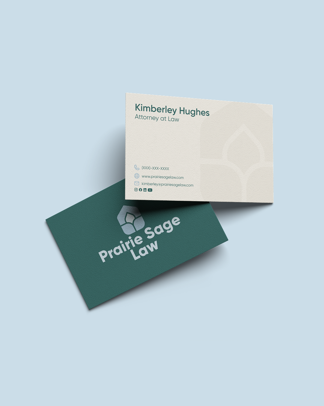
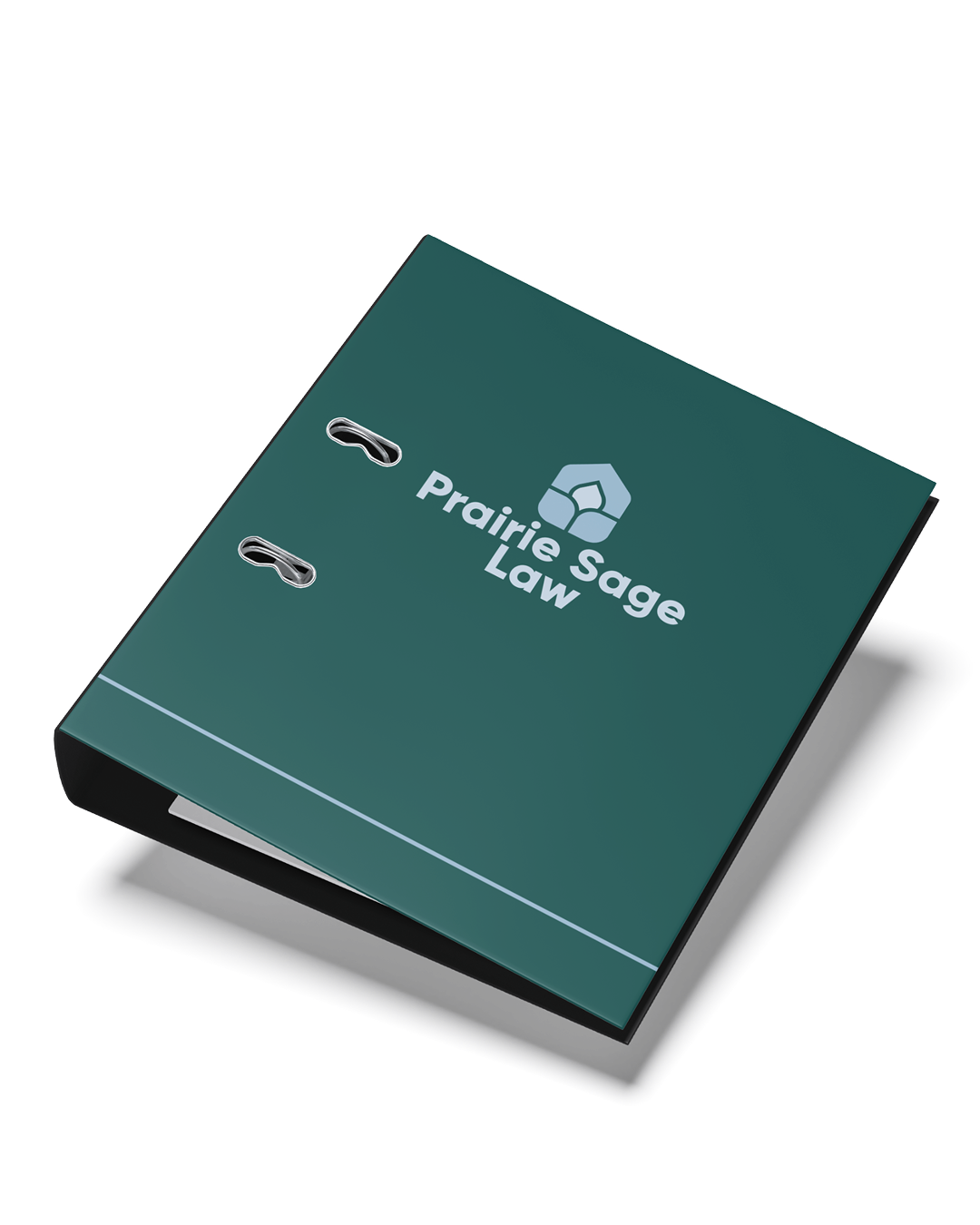
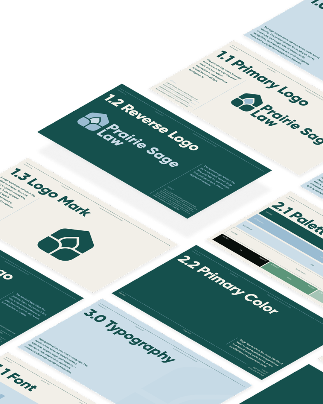
The new visual system combines deep green and soft blue tones with a custom logo mark inspired by natural growth and prairie elements, creating a look that feels established, welcoming, and professional. We carried the identity across typography, color standards, business cards, office materials, and other brand applications to ensure Prairie Sage Law could present a consistent image everywhere clients interact with the firm.
The finished rebrand gives Prairie Sage Law a stronger foundation for the future, one that feels uniquely its own while better aligning the brand with the business it has become.