June 2, 2026

MIX 105.5 - Branding

Project Summary

MIX 105.5, a premier radio station, required a comprehensive brand refresh to elevate its identity for a modern era while staying deeply true to its local roots. The new visual language is centered around a dynamic primary logo inspired by a vinyl record, capturing the energy, movement, and feeling the station brings to its listeners. By pairing a high-contrast palette of vibrant Mix Green and Yellow with grounding tones of Dark Green and Green Black, the updated identity achieves a remarkably clean, crisp aesthetic. Utilizing the sharp geometric lines of the REM typeface, the rebrand delivers a cohesive, highly recognizable look that perfectly balances small-town familiarity with a progressive, evolving sound.

A laptop on a pedestal displays the Adp home page featuring two people in red aprons, set against a dark gray background.
Big Dog radio brand overview with red sidebar, logo, and orange-black color palette.

The Challenge

The main hurdle for the brand was overcoming an outdated identity that lacked cohesive standards, which frequently led to visual fragmentation across various promotional and digital mediums. The legacy design felt static and rigid, failing to align with the high-energy, progressive nature of a modern radio station. While the original assets maintained a loyal connection with small-town listeners, the execution lacked the clean, contemporary polish required for today's media landscape. The objective was to completely re-imagine the identity to better represent the rhythm and energy of the broadcast, transitioning the brand from an aging design style into a crisp, clean aesthetic that resonates with both current and new listeners.

The Solution

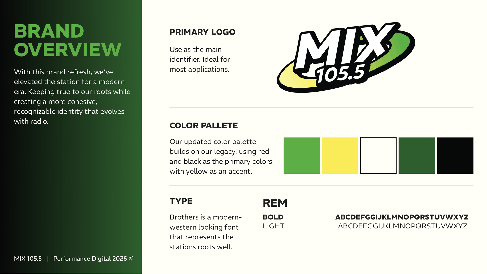
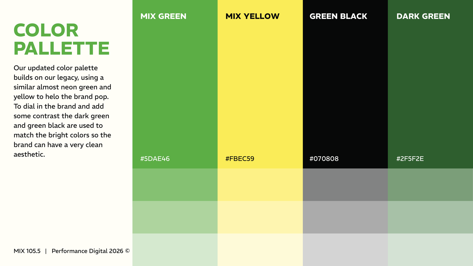
Our solution was a comprehensive brand refresh engineered to elevate the station for a modern era while remaining deeply true to its roots. To maintain crucial brand equity with the local audience, the new strategy intentionally builds on the station's color legacy—using an almost neon Mix Green and Yellow to make the brand pop, while introducing rich dark green tones to establish a premium, high-contrast look.


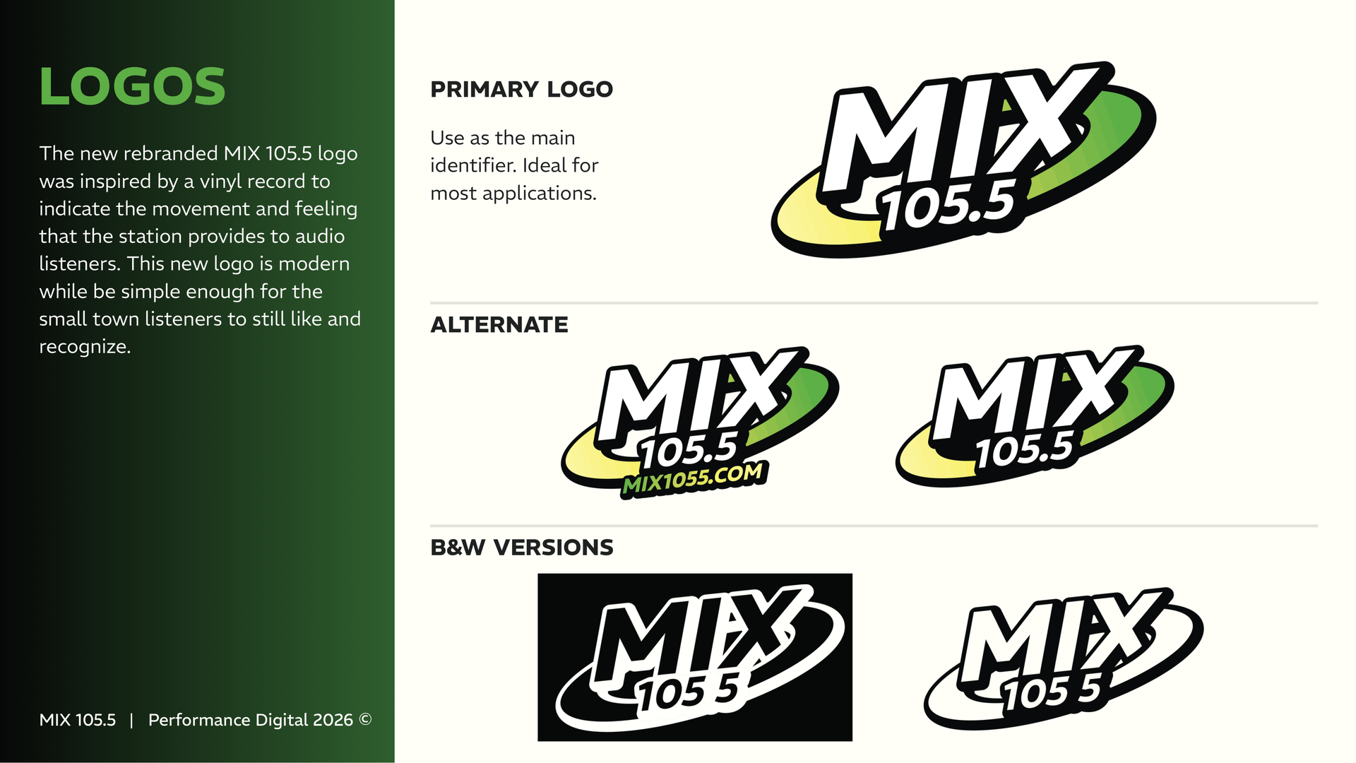
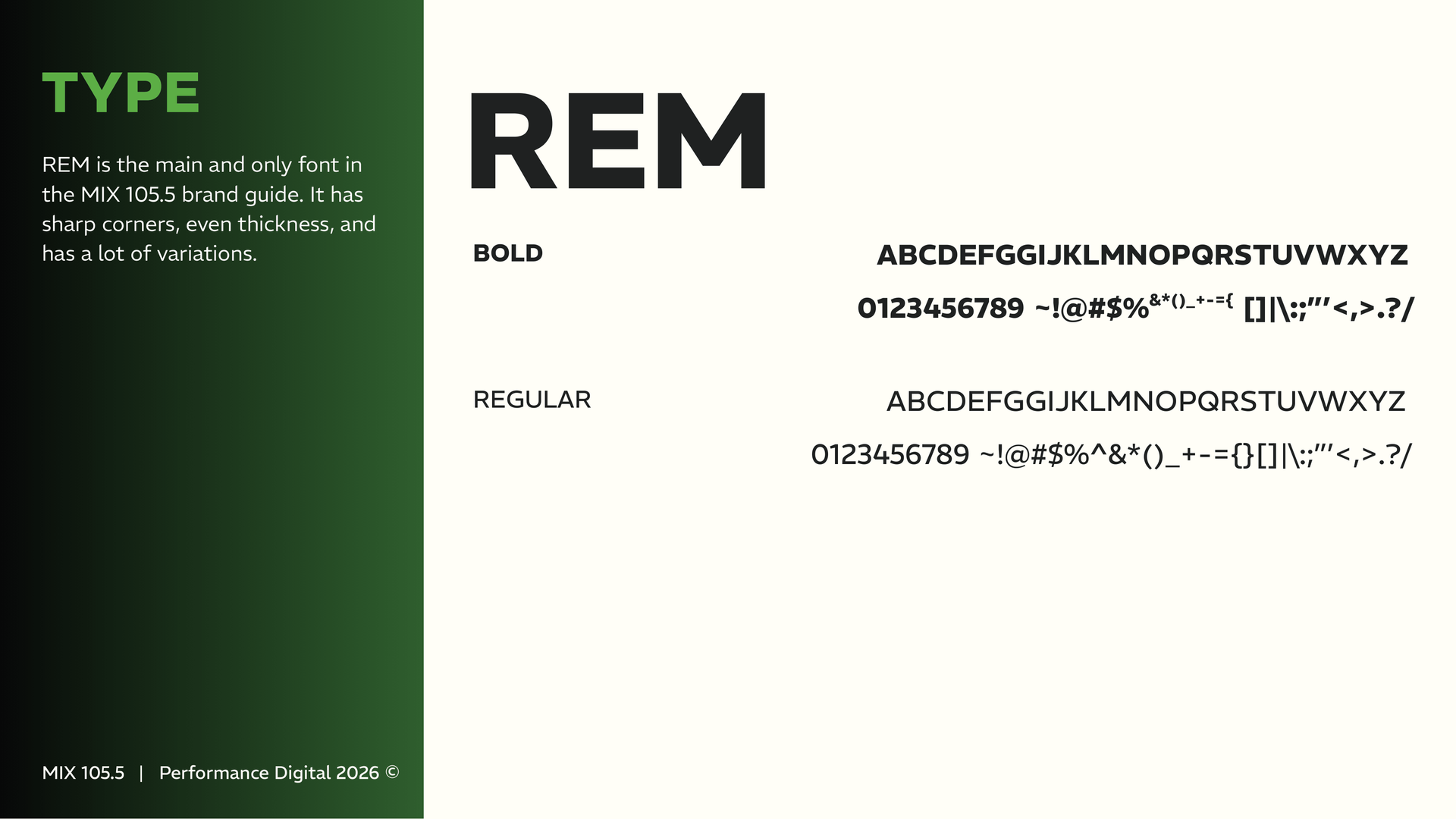
The cornerstone of this new identity is a versatile logo ecosystem. The master primary logo features a sleek, vinyl-record-inspired shape that captures the rhythmic energy of the broadcast. To ensure seamless adaptability, we paired this with clean alternate configurations and dedicated monochrome versions engineered specifically to pop on digital platforms, mobile screens, and merchandise. Driven by the modern, sharp corners of the REM font family, the resulting design system gives the station a unified, polished, and unmistakably contemporary presence across all physical and digital media.

Big Dog logo with orange dog head and red text, “98.9 * 1340” on dark background
June 1, 2026
Project Summary
Person typing on a laptop displaying “Welcome to Walnut Media USA” in a dark workspace.
By Sydney Burright April 23, 2026
Project Summary
A laptop on a wooden desk displays a website with the headline
By Sydney Burright April 8, 2026
Project Summary
November 28, 2025
Project Summary