A practical look at where AI helps marketers and where human judgement still matters.
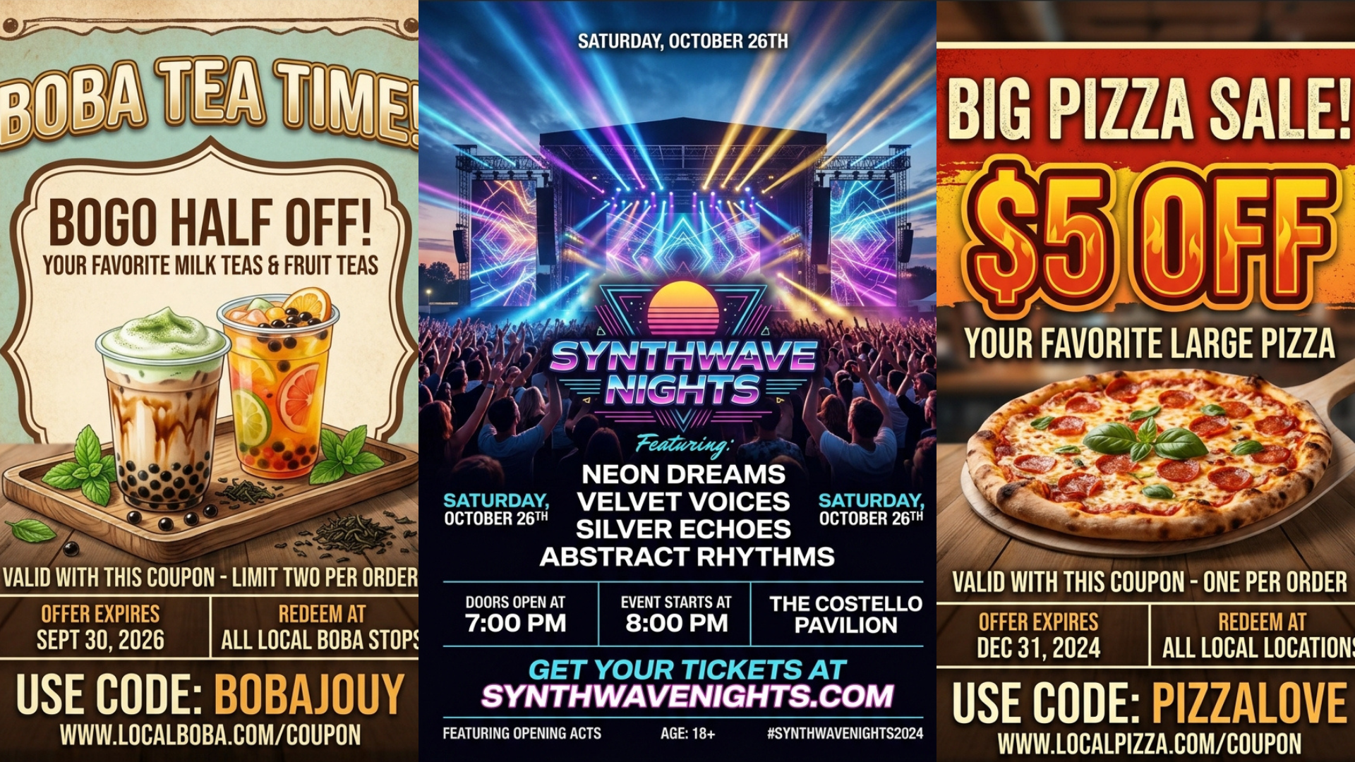
There's an instinct among certain business owners to keep up with the latest marketing trends, and right now, the trend is AI flyers. They're scattered across social media and aside from sales and promotions, can communicate a lot about what or who a brand is. The instinct is understandable, and for many business owners, a quick solution that can potentially elevate their brand is exactly what they need. The low barrier to entry seems attractive to someone who's already strapped for time and may not be able to afford a professional designer on a weekly basis, but here are a few things to consider and ask yourself before putting one of these flyers together.

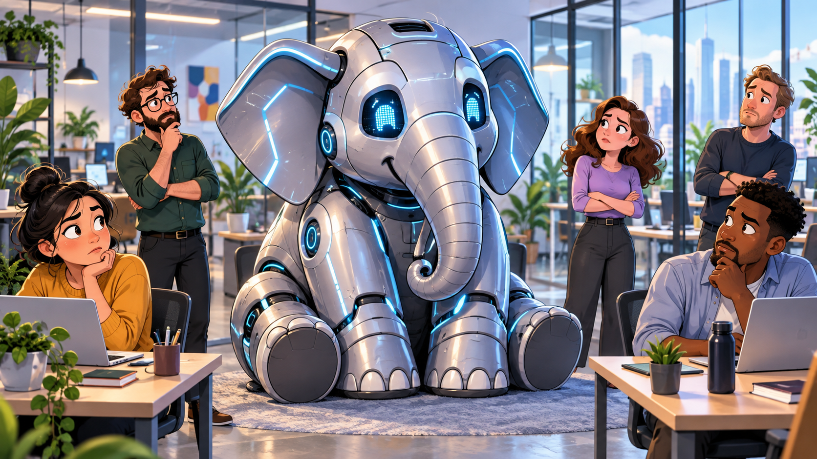
There’s a sentence I hear more and more often in digital marketing conversations: “Well, can’t I just use AI to make that?” And the answer is… probably. You can use AI to write a blog, create social posts, generate an image, draft an email, come up with Google Ads headlines or build a content calendar in seconds. I’m not going to tell you that’s a bad thing. We use AI, too. It has made parts of our jobs faster, helped us work through ideas and given marketers access to tools we couldn’t have imagined a few years ago. But being able to make something and knowing what you should make are two very different things.
Running ads on every platform feels like progress. But if the same message is just copied from one channel to the next, you’re leaving your best growth on the table. Here’s the difference, and why it matters most for small and medium businesses. If you run a small or medium business, you’re probably already doing more marketing than you get credit for. You’re on Google. You’re on Instagram and Facebook. Maybe you’ve dabbled in YouTube, sent a few emails, or put your name on a billboard. By most definitions, you’re “everywhere.” That’s multichannel marketing, and it’s a solid foundation. But being present on a lot of channels isn’t the same as making those channels work together. The businesses that pull ahead aren’t the ones on the most platforms. They’re the ones running omnichannel campaigns: one clear idea, adapted to each channel and each audience, so the whole thing feels like a single, coordinated story. For a business with a limited budget, that distinction isn’t a nice-to-have. It’s the difference between spending money to be seen and spending money to be remembered.

What Is Marketing Data?
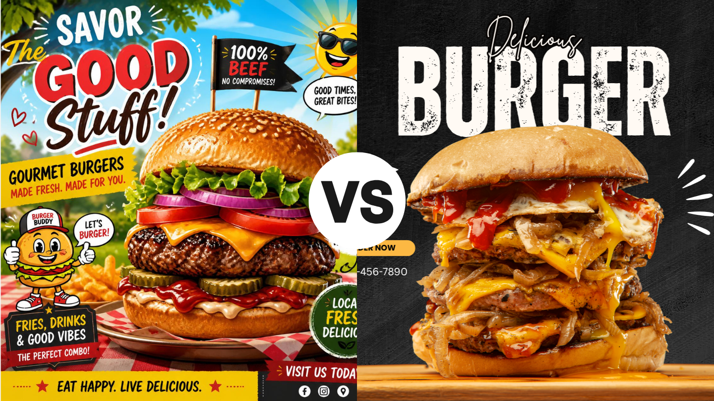
There's a pattern showing up everywhere right now. A business needs a logo, so someone types a prompt. They need a website, so they pull the two loudest colors out of that logo and call it a palette. They need social posts and an event flyer, so they generate more of the same. Then they paste the identical mark across every surface they own and call the whole thing branding. Here's what most owners and marketing leads don't realize: their audience can tell. Gen Z and millennials can spot generated work almost instantly, and the reaction isn't neutral. It reads as cheap, lazy, and fake. Gen Z is skeptical of AI across the board, but the skepticism gets sharpest when a company uses it for the things that are supposed to represent who they are. A generated logo doesn't say "we're efficient." It says, "We didn't care enough to make this ourselves." A brand is an ecosystem, not a file. The mistake underneath all of this is a definition problem. People think a brand is a logo. A brand is an ecosystem of decisions, strategy, voice, and visuals, woven into what a company believes and how it operates. Trying to rebuild that ecosystem from copies of a single generated graphic is like populating an entire planet with a single organism. Nothing adapts. Nothing has a role. There's no relationship between the parts because there was never a system, just a file that got duplicated. Generative AI isn't at a place where it can replicate the human touch that makes a brand ecosystem work. It can get you a passable logo, barely. Asking it to carry the attention to detail a professional designer brings to an entire identity system, and to maintain that level of detail consistently across dozens of touchpoints, isn't something it can do yet. Why the ecosystem matters more than the logo Every business that has found even minimal success has a real brand behind it. That's not a coincidence, and it's not because the logo was pretty. A strong brand does three things that go straight to the bottom line: It builds trust and credibility fast. People decide whether you're legitimate before they read a single word of copy. It creates consistency across every touchpoint. Ads, signage, social, email, and physical assets. When all of it feels like one company, you feel like a company worth buying from. It stretches your marketing budget. A strong brand makes every campaign more effective, which means the same spend does more work. Weak branding means you're paying to reintroduce yourself every single time. The building blocks, in the order that works 1 - Know who you are and who you're for This is the step everyone skips, and it's probably the most common reason businesses stall out. If you can't articulate your identity and your audience, nothing downstream has anything to hold onto. 2 - Build the visual identity Logos, colors, type. This is the flashy step, the one everyone wants to start with, because it's the face of the brand and it's what people point at. Built on a weak base, it means next to nothing. 3 - Combine them into voice and messaging Steps one and two together tell you how the brand speaks. Values plus visuals equals how you want to be seen, how you're represented, and how you communicate. 4 - Stay consistent everywhere The step that looks the least glamorous and matters just as much. The right logo, type, and colors in every place your brand appears, plus a voice that holds steady across all of it. Successful brands don't just do these steps. They do them in this order. Signs your branding needs work Your look shifts depending on the platform Nothing clearly separates you from your competitors. Your team can't describe the brand in one sentence. Every marketing push feels like starting from scratch. If more than one of those landed, the problem isn't your logo. It's that there was never a foundation under it. How we approach it at Performance Digital We spend most of our energy on the steps people skip. It starts with a 60-to-90-minute guided discovery session. We ask complex questions designed to get to the root of who you are, covering primary audience considerations, brand personality and attributes, desired market positioning, and voice and tone direction. It's not a form. It's a conversation that surfaces things most teams have never put into words. From there, we write a brand brief: brand direction, target audience, brand personality, positioning priorities, visual objectives, and voice and tone characteristics. All of that happens before a single logo concept gets sketched. That's the point. By the time we start designing, we already know exactly what the design must accomplish, so every choice traces back to something real about your business. Let's look at yours If any of the signs above sounded familiar, it's worth getting a second set of eyes on it before you spend another dollar pushing an identity that isn't working. Reach out for a brand audit , and we'll walk through where your brand stands today, what's holding it back, and what it would take to build something your audience believes.