5 Ways Cohesive Branding Boosts Customer Trust and Recognition

Sydney Burright • August 25, 2025

Branding isn't just a logo slapped on a website or instagram post. When your branding is consistent across everything, it actually makes people trust you more and remember you easier. Here's why it matters and why it's way easier than it sounds:

People Recognize You Instantly

Ever scroll through your Facebook feed and instantly know which brand a post is from? That's the magic of consistent colors, fonts, and logos. When everything looks like it belongs together, people start recognizing your brand without even thinking about it.


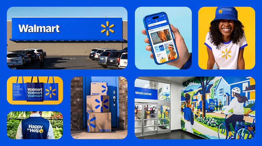
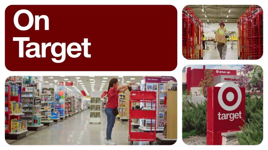
Big companies like Target and Walmart totally nail this. Target's signature red shows up everywhere like their ads, store signage, website, even their shopping carts inside the store. Same with Walmart's blue and yellow palette. They could run an ad with no logo at all, and people would still recognize it as Walmart immediately.


But small businesses can do this too! Even a local coffee shop that always uses the same cozy brown tones, unique font, and hand-drawn style across their social media, packaging, and storefront signage can become instantly recognizable in their community. You don't need to be a giant corporation, consistency is what makes your brand stick.

Walmart branding: store, app, smiling person, bags, packages, entrance, and mural. Blue and yellow colors.

You Actually Connect With People

Familiar visuals feel comforting. When your brand stays consistent, it helps people feel like they know you. When people feel like they know you, they're more likely to care about what you're offering.


Think about it: whenever a big company rolls out a new logo or does a major rebrand, people usually freak out at first. There's tons of online chatter about how "the old one was better" or "why did they change it?" But over time, people get used to it especially if the new branding is still consistent across their products, ads, and social media. This is proof that consistency isn't just about looking nice but it actually builds that sense of trust and familiarity with your audience.

You Look Like an Actual Business

Messy or inconsistent branding can make your business look unprofessional. But when your visuals are cohesive across your website, social posts, and ads, it screams "we know what we're doing," and people trust you more. Consistency shows that your business pays attention to detail, cares about its image, and has a clear vision. When everything looks like it belongs together, customers feel more confident that your products or services are reliable and high-quality.

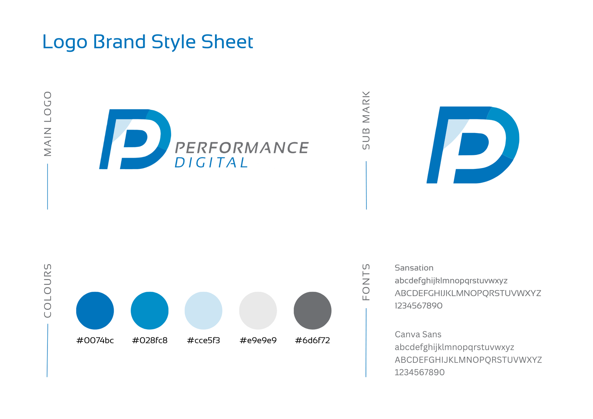
Logo brand style sheet for Performance Digital. Features logo, color palette (blue, light blue, gray), and font information.

Marketing Becomes Way Easier

If you've got your brand colors, fonts, and style locked in, creating posts, ads, or emails is a breeze. No more guessing which font to use or if that color works because your branding is already solidified and you don't need to do any heavy lifting.

People Stick Around and Buy Stuff

Trust + Recognition + Connection = people paying attention, coming back, and maybe even telling their friends about you. Cohesive branding makes it easier to turn casual visitors into loyal fans.


The bottom line is branding doesn't have to be complicated. Keep it consistent, keep it clear, and people will notice. Your visuals tell your story so make sure they're saying the right thing everywhere.

Share

Hands around a table reviewing colorful business charts and graphs on papers and tablets.
By Alexis Rios August 26, 2026
What Is Marketing Data?
Side-by-side burger ad comparing an AI burger ad and a real burger ad
By Brayden Will August 19, 2026
There's a pattern showing up everywhere right now. A business needs a logo, so someone types a prompt. They need a website, so they pull the two loudest colors out of that logo and call it a palette. They need social posts and an event flyer, so they generate more of the same. Then they paste the identical mark across every surface they own and call the whole thing branding. Here's what most owners and marketing leads don't realize: their audience can tell. Gen Z and millennials can spot generated work almost instantly, and the reaction isn't neutral. It reads as cheap, lazy, and fake. Gen Z is skeptical of AI across the board, but the skepticism gets sharpest when a company uses it for the things that are supposed to represent who they are. A generated logo doesn't say "we're efficient." It says, "We didn't care enough to make this ourselves." A brand is an ecosystem, not a file. The mistake underneath all of this is a definition problem. People think a brand is a logo. A brand is an ecosystem of decisions, strategy, voice, and visuals, woven into what a company believes and how it operates. Trying to rebuild that ecosystem from copies of a single generated graphic is like populating an entire planet with a single organism. Nothing adapts. Nothing has a role. There's no relationship between the parts because there was never a system, just a file that got duplicated. Generative AI isn't at a place where it can replicate the human touch that makes a brand ecosystem work. It can get you a passable logo, barely. Asking it to carry the attention to detail a professional designer brings to an entire identity system, and to maintain that level of detail consistently across dozens of touchpoints, isn't something it can do yet. Why the ecosystem matters more than the logo Every business that has found even minimal success has a real brand behind it. That's not a coincidence, and it's not because the logo was pretty. A strong brand does three things that go straight to the bottom line: It builds trust and credibility fast. People decide whether you're legitimate before they read a single word of copy. It creates consistency across every touchpoint. Ads, signage, social, email, and physical assets. When all of it feels like one company, you feel like a company worth buying from. It stretches your marketing budget. A strong brand makes every campaign more effective, which means the same spend does more work. Weak branding means you're paying to reintroduce yourself every single time. The building blocks, in the order that works 1 - Know who you are and who you're for This is the step everyone skips, and it's probably the most common reason businesses stall out. If you can't articulate your identity and your audience, nothing downstream has anything to hold onto. 2 - Build the visual identity Logos, colors, type. This is the flashy step, the one everyone wants to start with, because it's the face of the brand and it's what people point at. Built on a weak base, it means next to nothing. 3 - Combine them into voice and messaging Steps one and two together tell you how the brand speaks. Values plus visuals equals how you want to be seen, how you're represented, and how you communicate. 4 - Stay consistent everywhere The step that looks the least glamorous and matters just as much. The right logo, type, and colors in every place your brand appears, plus a voice that holds steady across all of it. Successful brands don't just do these steps. They do them in this order. Signs your branding needs work Your look shifts depending on the platform Nothing clearly separates you from your competitors. Your team can't describe the brand in one sentence. Every marketing push feels like starting from scratch. If more than one of those landed, the problem isn't your logo. It's that there was never a foundation under it. How we approach it at Performance Digital We spend most of our energy on the steps people skip. It starts with a 60-to-90-minute guided discovery session. We ask complex questions designed to get to the root of who you are, covering primary audience considerations, brand personality and attributes, desired market positioning, and voice and tone direction. It's not a form. It's a conversation that surfaces things most teams have never put into words. From there, we write a brand brief: brand direction, target audience, brand personality, positioning priorities, visual objectives, and voice and tone characteristics. All of that happens before a single logo concept gets sketched. That's the point. By the time we start designing, we already know exactly what the design must accomplish, so every choice traces back to something real about your business. Let's look at yours If any of the signs above sounded familiar, it's worth getting a second set of eyes on it before you spend another dollar pushing an identity that isn't working. Reach out for a brand audit, and we'll walk through where your brand stands today, what's holding it back, and what it would take to build something your audience believes. 
Smartphone on a tripod recording a woman speaking indoors, with a ring light above the phone.
August 13, 2026
What is Social Media Algorithm?
Hands typing on a laptop displaying a website on a white desk
By Sydney Burright August 4, 2026
Trendy web design can quietly wreck your conversion rate. Learn how heavy visuals, buried CTAs, and slow load times kill CRO — and what to do instead.
Hands using a smartphone to browse a clothing website on a computer screen.
By Sydney Burright July 14, 2026
Most businesses launch a website and forget about it. Here's what you should actually be doing after launch to keep your site secure, visible, and working for your business.
Hands holding a game controller beside a smartphone, keyboard, and laptop on a desk.
By Performance Digital June 26, 2026
Most businesses treat social media as an awareness-only play. The idea is usually, “Let’s post consistently, grow followers, stay top of mind.” This always looks great on paper but fails to address your audience at each phase of the buyer’s journey. With strategic content built for each part of the funnel, social media can and should addresses each step in your audience’s journey from awareness to conversion.  Here's a different way to think about it.