Cracker Barrel’s Rebrand: Simplification vs. Nostalgia

Sydney Burright • August 21, 2025

Cracker Barrel has been known for not just their country style cooking, but also for the nostalgic charm that greets customers the moment they step inside. Everything about the brand has been tied to comfort and tradition. That's why the company's recent logo redesign has sparked such a strong reaction online.


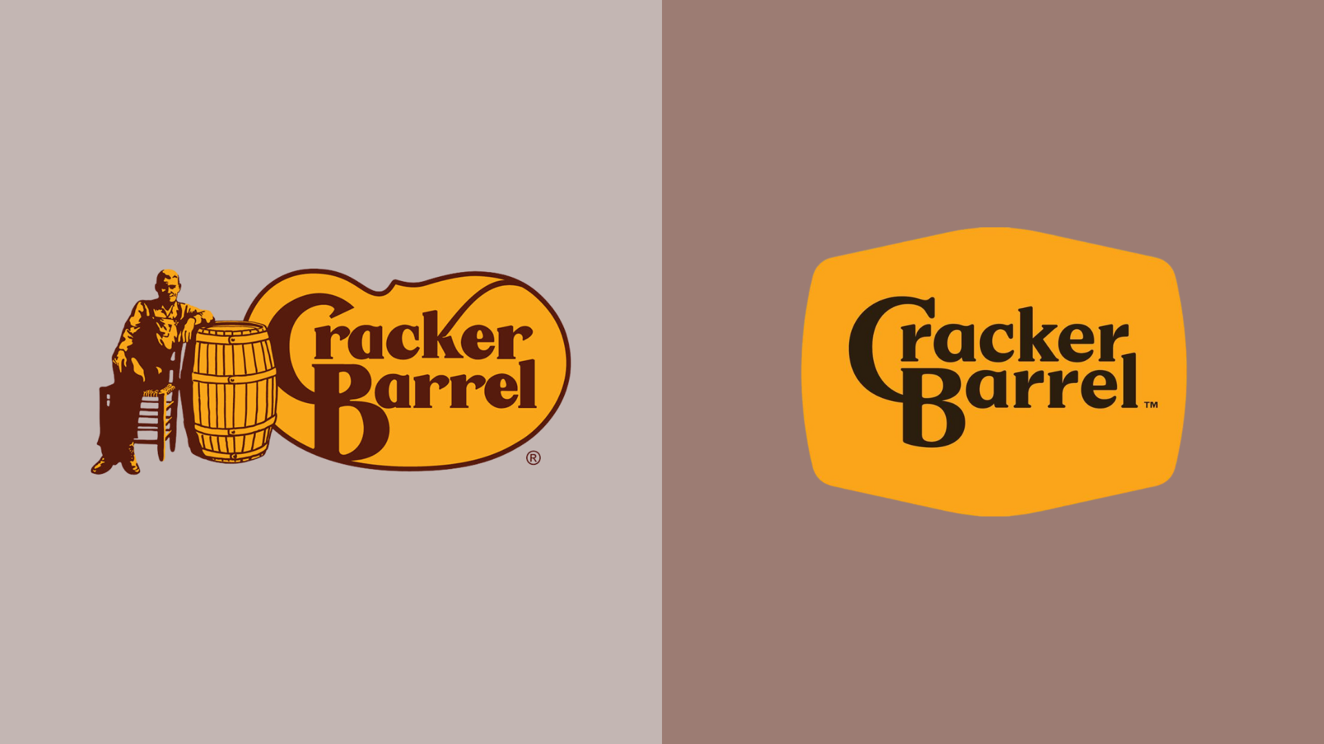
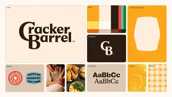
Cracker Barrel gave its logo a makeover. They kept the same gold and brown colors, but they took out one big detail: the man sitting next to the wooden barrel. Now it’s a much more simplified, modern-looking design. But many longtime fans aren't on board. Social media was quick to light up with criticism. For a lot of customers the original design carried nostalgia and a kind of charm that you don't just get everywhere.

Cracker Barrel branding guide: logo, color palette (browns, oranges), illustrated barrel, fonts, and imagery (food, textures).

Why Brands Are Simplifying Their Logos

Cracker Barrel isn't alone in this. Over the past decade, many major brands, like Burger King and Pepsi, have updated their logos to be more streamlined. The reasoning often comes down to a few different reasons.


It looks better online. Simple logos are easier to read on apps, websites, and tiny profile pictures.


It feels "fresh". Companies want to look modern, especially for younger audiences.


It's flexible. A clean design works across packaging, ads, and digital platforms.


From a design and marketing perspective, these reasons make sense. A clean, bold logo is easier to adapt in today's digital-first world.

The Tradeoff: Nostalgia and Emotional Connection

The problem? Simpler doesn't always mean better. Especially for brands that use nostalgia as a marketing tool. The old Cracker Barrel logo instantly reminded people of Sunday road trips, family meals, and a sense of comfort. By removing the man and the barrel, Cracker Barrel risks losing some of that emotional connection. Taking it away feels, to some, like taking away the soul of the brand.


This tension between modernization and tradition is one many brands face. Do you evolve to stay relevant, or do you hold on to the imagery that made people love you in the first place?

What Businesses Can Learn from This

If you are a business thinking about rebranding, Cracker Barrel might be a great case study.


Update your branding, but don't erase it. Modernizing your look is important, but make sure you aren't removing the parts of your brand that people are emotionally connected to. Think digital, but think human too. A logo should work on a smartphone screen, but it also should make people feel something. Test the waters. Before rolling out a new look, gather feedback from your audience to see how they respond.


Rebranding can be powerful when it's done thoughtfully. The key is balancing "fresh and modern" with the personality and story that made people love your brand in the first place.


Cracker Barrel's new logo works better in today's digital world, but it's also a reminder that you still need to make people feel connected. Just like with every company rebrand, customers will eventually get used to the new look, but it can take some time.

Share

Hands holding a game controller beside a smartphone, keyboard, and laptop on a desk.
By Performance Digital June 26, 2026
Most businesses treat social media as an awareness-only play. The idea is usually, “Let’s post consistently, grow followers, stay top of mind.” This always looks great on paper but fails to address your audience at each phase of the buyer’s journey. With strategic content built for each part of the funnel, social media can and should addresses each step in your audience’s journey from awareness to conversion.  Here's a different way to think about it.
Collage of colorful fast-food, pizza, burger, and drink ads in a grid layout
By Sydney Burright June 24, 2026
Let's say you just got an ad back from your designer. It's clean, it's simple. It has an image, a headline, and a call to action saying "shop now". But now you want to add another tagline, a list of features, and a disclaimer at the bottom in tiny font. Suddenly the ad now looks like a flyer posted on a bulletin board. This happens constantly in digital marketing, and it is one of the biggest reasons ads don't perform well. The fix is not complicated, but first you need to understand why adding all that extra information to the ad is a huge problem.
Blue graphic with labeled bubbles “BOOMER,” “X,” “Y,” “Z” beside a white funnel icon
By Alexis Rios May 26, 2026
Why Generational Consumer Behavior Matters More Than Ever
UX vs UI comparison graphic with two website mockups on a white background
By Sydney Burright May 19, 2026
If you've ever scrolled through a website or app and thought, "Wow this website looks really cool," but then couldn't figure out how to actually checkout or find the menu, you've experienced the tug-of-war between UI and UX. These terms get thrown around a lot in the tech and marketing world, and sometimes are often put together ("UI/UX"). But while they are basically best friends who work together, they are definitely not the same thing. If you are a student looking into design or a business owner trying to figure out why your website isn't bringing you sales, here is the breakdown.
Laptop displaying a website beside a red flag on a black pole
By Sydney Burright April 23, 2026
You can have the best business in the world, but if you don't have a website or your current website looks really outdated, people are going to click the "X" and leave your website before they even see what you do. As a designer, I see these same mistakes every single day. The good news is that most of your website's problems are super easy to fix. If your site has any of these 5 red flags, then it's time to build a new one or give your current site a little glow-up.
A presentation in a classroom with two speakers in front of a projection screen and several attendees seated at tables.
By Sydney Burright March 20, 2026
Let’s be real: in 2026, if your business isn’t online, it basically doesn’t exist. When people hear about a new brand, the first thing they do is stalk the website or look for the Google reviews or check out their social media. We recently presented the 7 Marketing Essentials Every New Business Needs to contestants at The Fremont Pitch It Contest and students at Midland University and we want to share our insight with everyone. Whether you're just starting out or leveling up your current set up, here is your starter pack for digital success.