

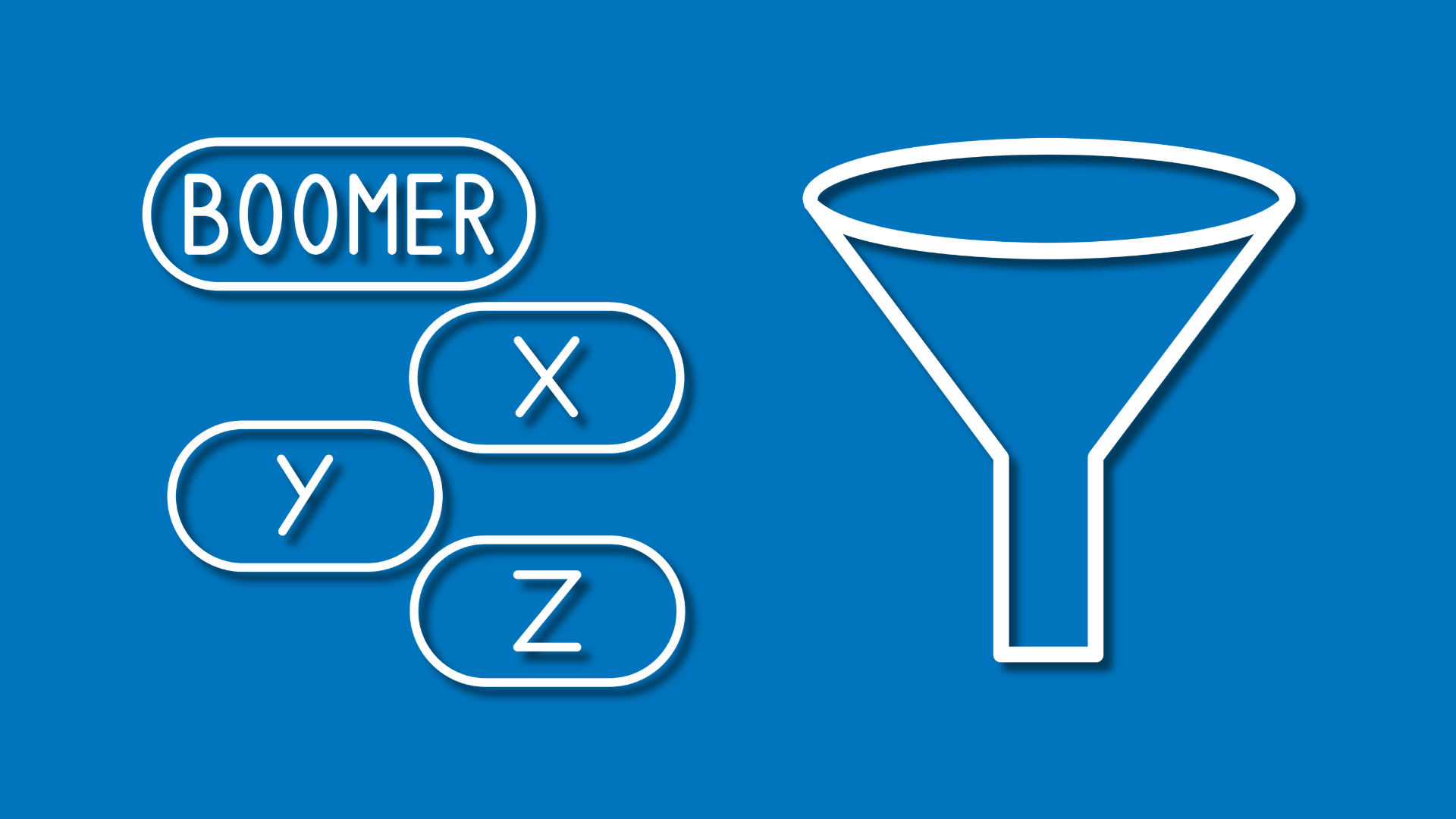
Why Generational Consumer Behavior Matters More Than Ever
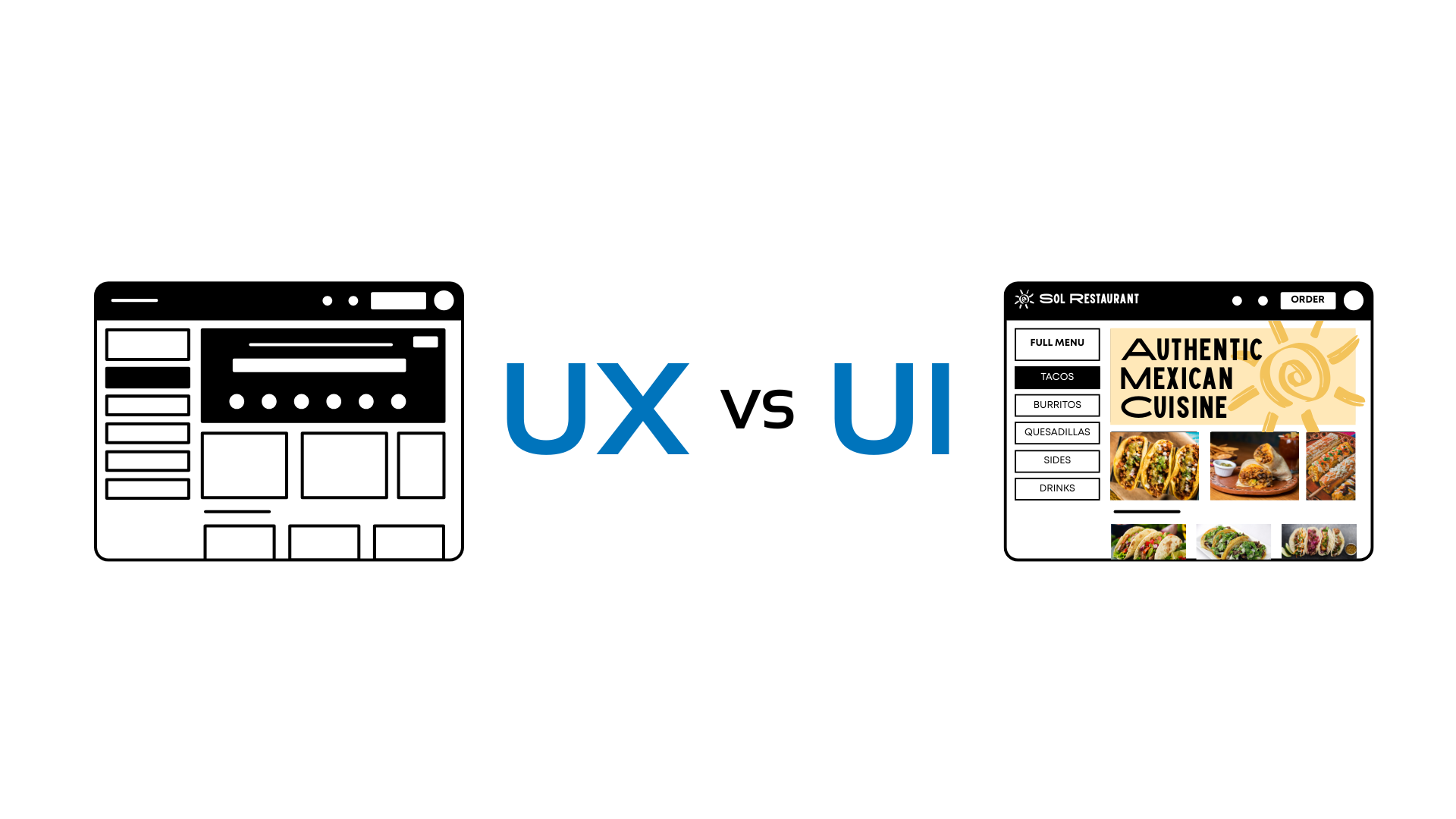
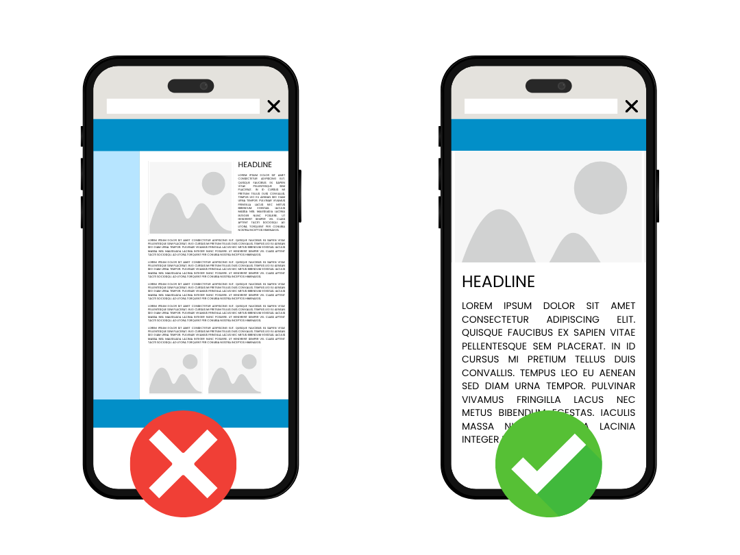
If you've ever scrolled through a website or app and thought, "Wow this website looks really cool," but then couldn't figure out how to actually checkout or find the menu, you've experienced the tug-of-war between UI and UX. These terms get thrown around a lot in the tech and marketing world, and sometimes are often put together ("UI/UX"). But while they are basically best friends who work together, they are definitely not the same thing. If you are a student looking into design or a business owner trying to figure out why your website isn't bringing you sales, here is the breakdown.

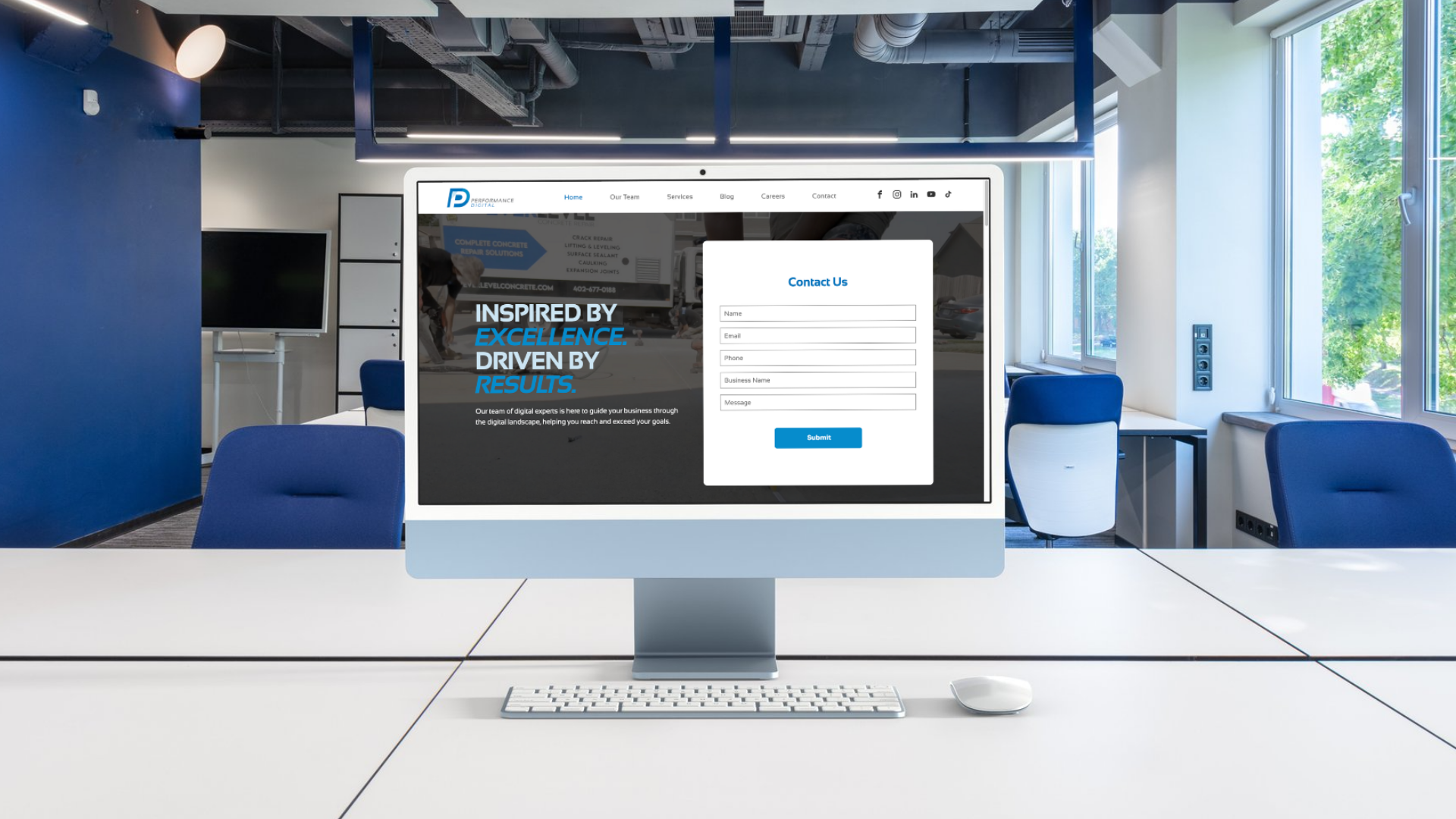
You can have the best business in the world, but if you don't have a website or your current website looks really outdated, people are going to click the "X" and leave your website before they even see what you do. As a designer, I see these same mistakes every single day. The good news is that most of your website's problems are super easy to fix. If your site has any of these 5 red flags, then it's time to build a new one or give your current site a little glow-up.

Let’s be real: in 2026, if your business isn’t online, it basically doesn’t exist. When people hear about a new brand, the first thing they do is stalk the website or look for the Google reviews or check out their social media. We recently presented the 7 Marketing Essentials Every New Business Needs to contestants at The Fremont Pitch It Contest and students at Midland University and we want to share our insight with everyone. Whether you're just starting out or leveling up your current set up, here is your starter pack for digital success.
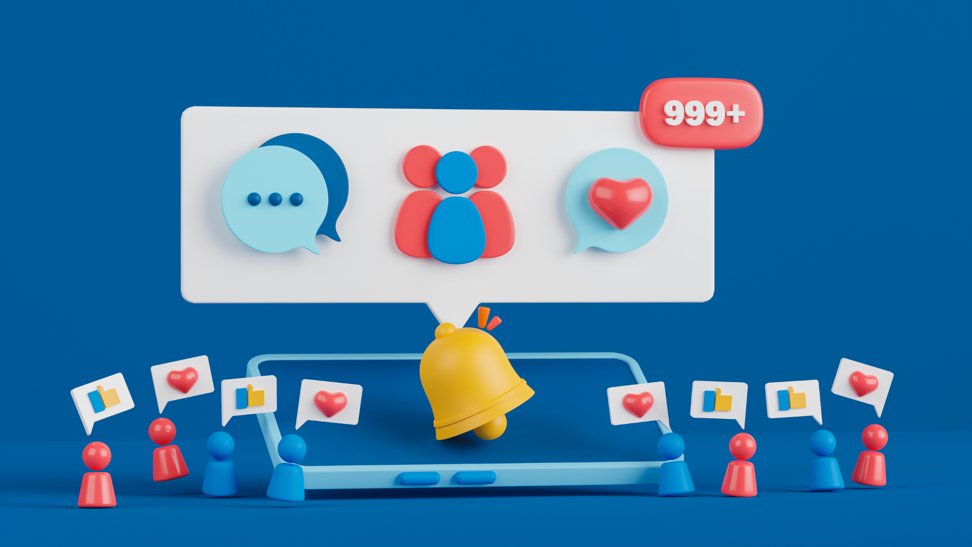
Going viral is often viewed as the ultimate social media success. One video takes off, views skyrocket, and suddenly your brand is in front of thousands or even millions of new users. While viral content can be incredibly valuable for brand awareness, it is not realistic or sustainable to rely on virality alone. The primary goal of social media marketing is not to go viral with every post. The goal is to clearly communicate who your business is, what you offer, and why your audience should continue engaging with your content. Virality should support your strategy, not replace it.

First Impressions Aren't Just In-Person Anymore